


A legacy of cross-cultural design and branding since 1964.

‣ About
‣ Brand Design
‣ Case Studies
‣ Poster Design
‣ Non Profit Design
‣ Press

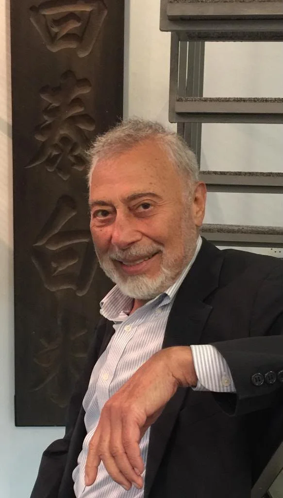
Recognised as Hong Kong’s Father of Graphic Design, Henry Steiner has shaped the visual language of Hong Kong and China through his distinctive cross-cultural lens.
Forward-looking yet deeply rooted in heritage, the work we produce at Steiner&Co. reflects the way in which our clients continue to navigate the present and future. Each project and collaboration articulates and defines who the client really is.
Contact
info@steiner.hk
852.2548.5548
28c Conduit Road, Hong Kong
“A designer should not have a style. This is a serious threat to design. The idea must always come first. We strive for design, not decoration. We are here to make ordinary objects extraordinary — pleasant, useful, witty, and sometimes inspiring.”



Poster Design
The virtues of cross culturalism? Cross-pollination, the creation of new nuances, extended sensibilities.
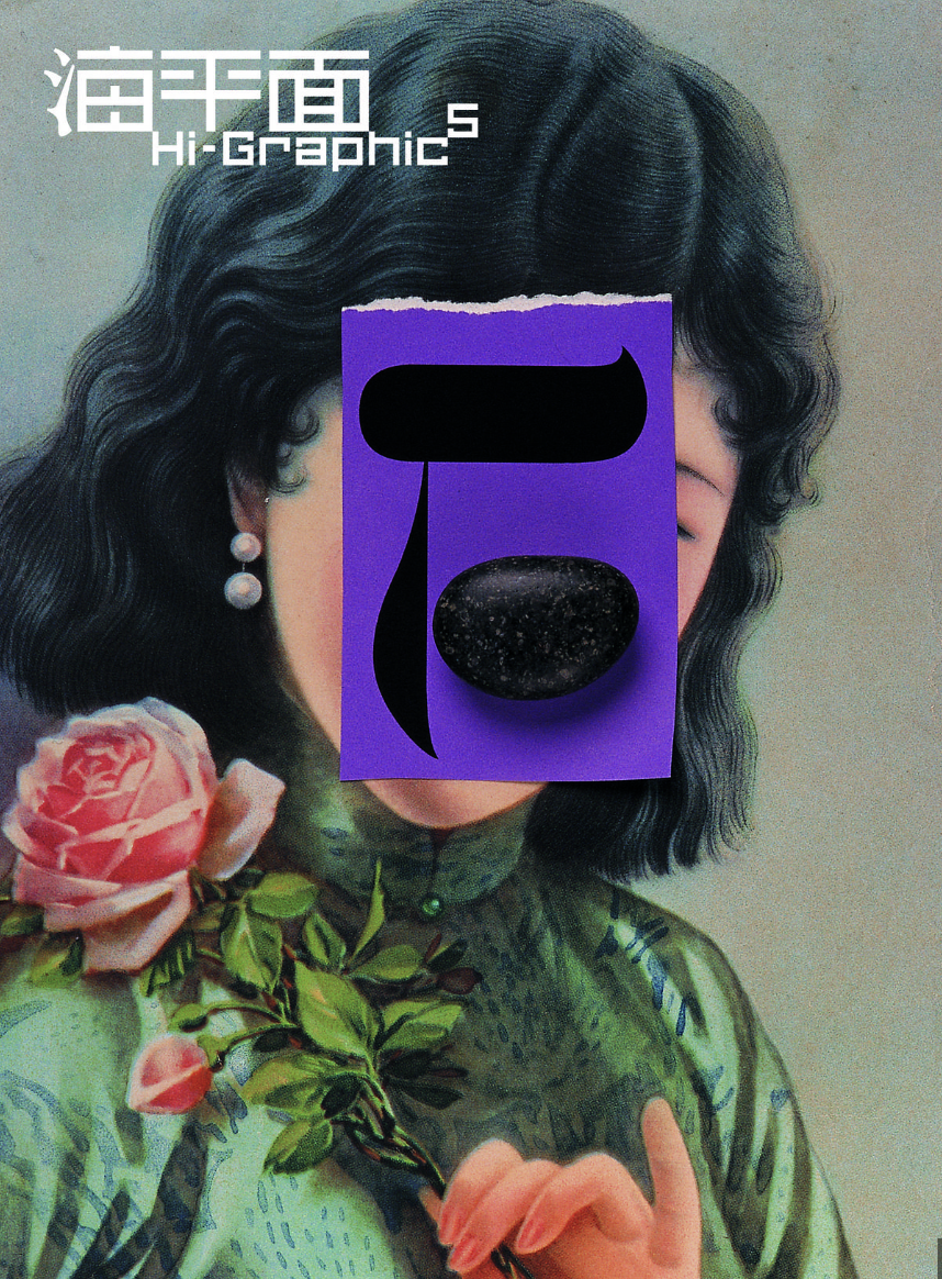
Hi-Graphic, No 5/6, 1998
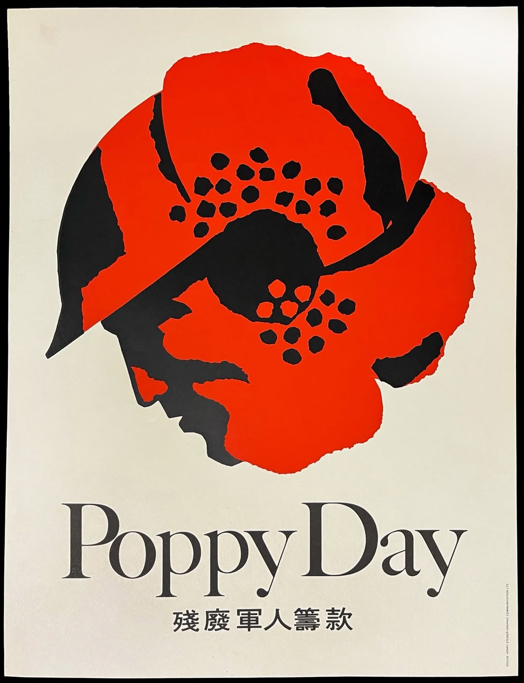
Poppy Day, 1960s
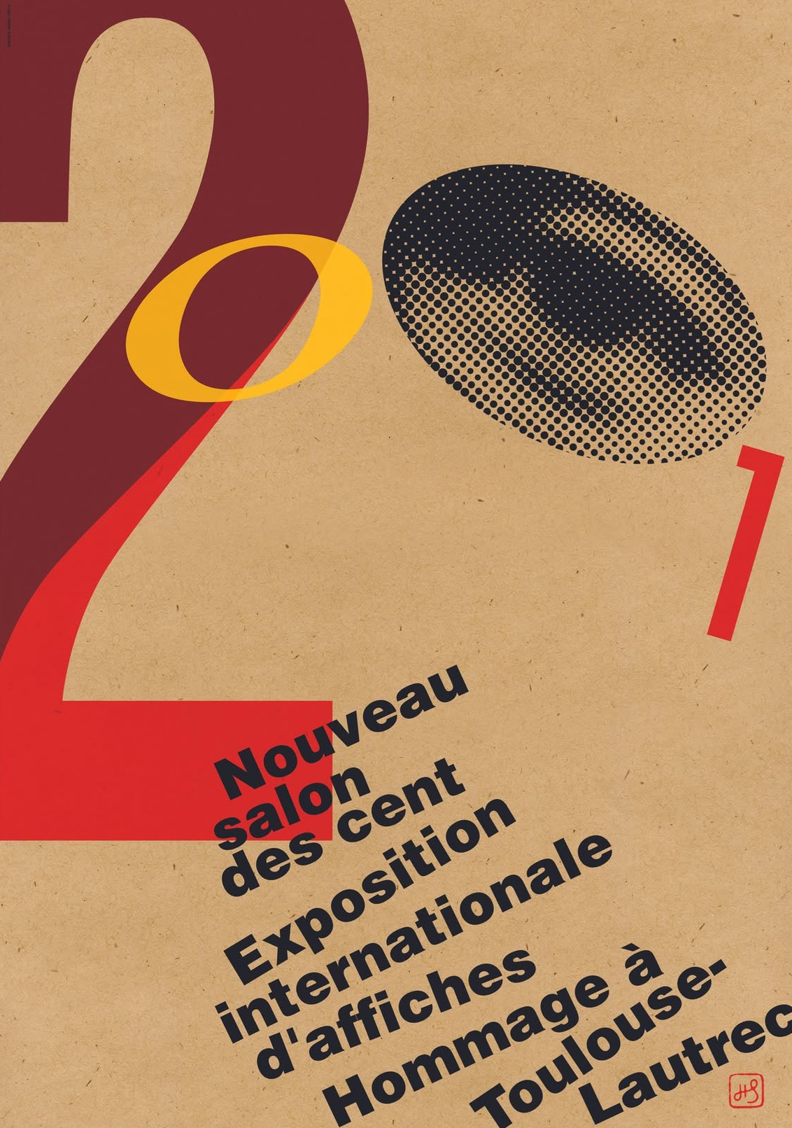
Homage to Toulouse-Lautrec, France, 2001
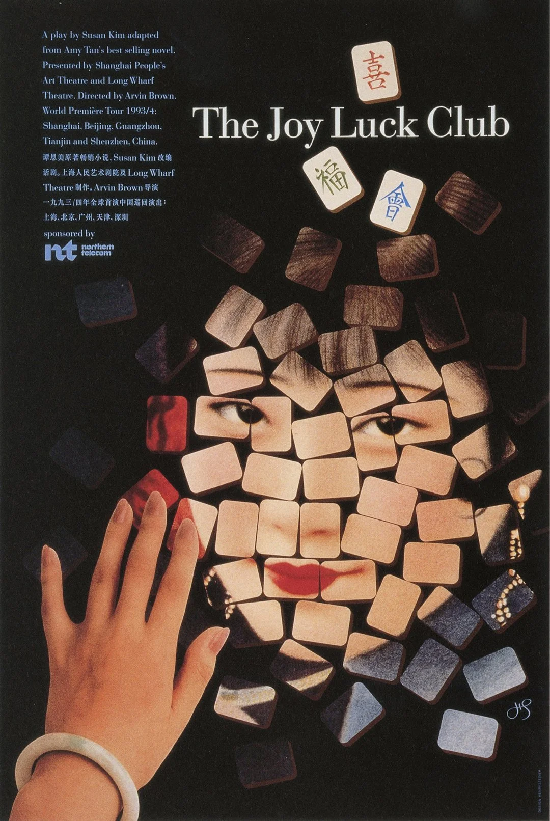
Joy Luck Club, Shanghai, 1993
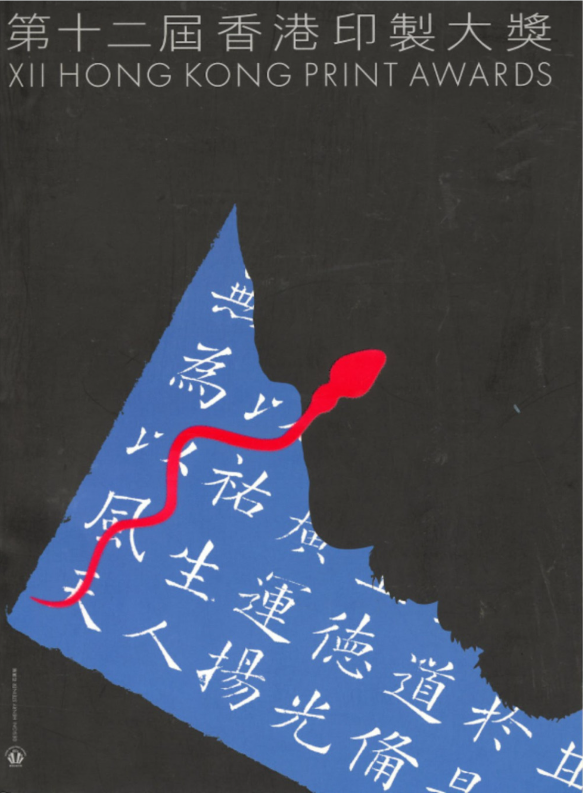
XII Hong Kong Print Awards, 2000
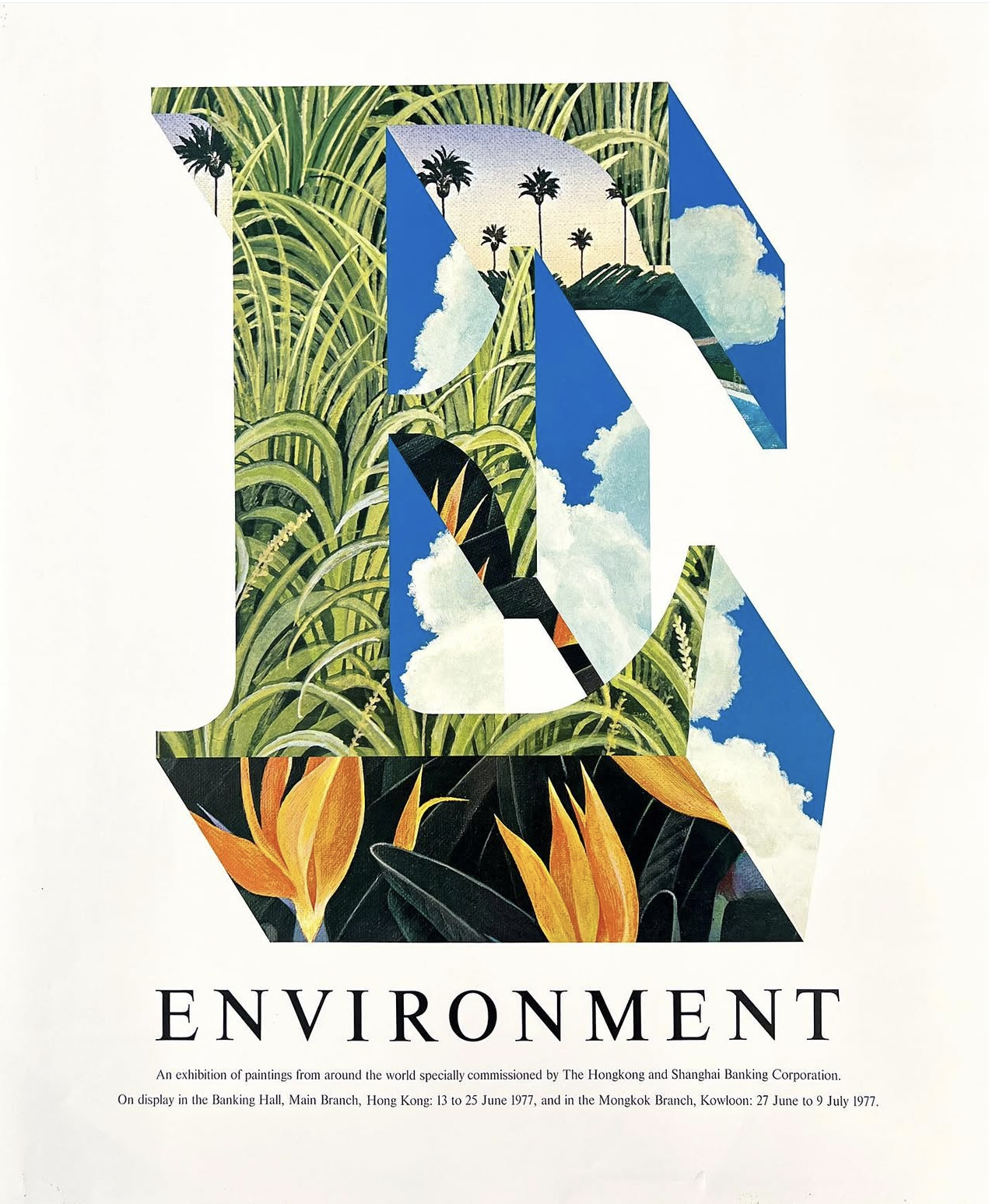
E-Environment, The Hongkong and Shanghai Banking Corporation (English version), 1977
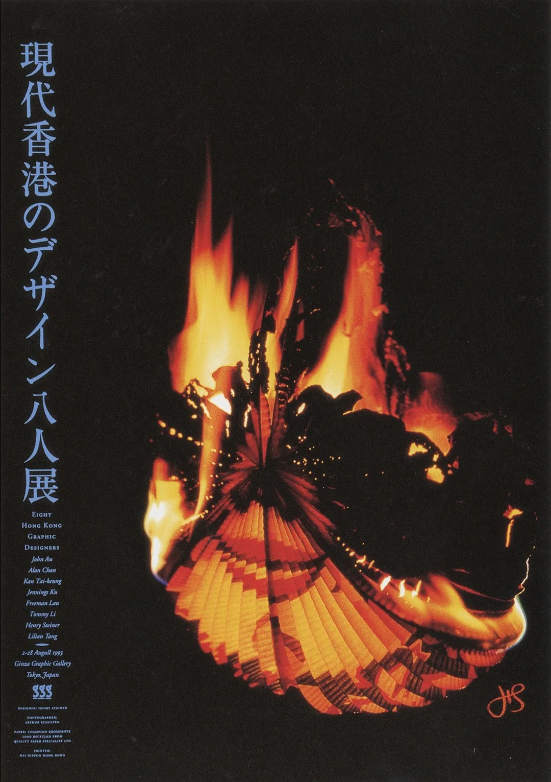
Eight Hong Kong Graphic Designers Exhibition, Ginza Graphic Gallery, 1993
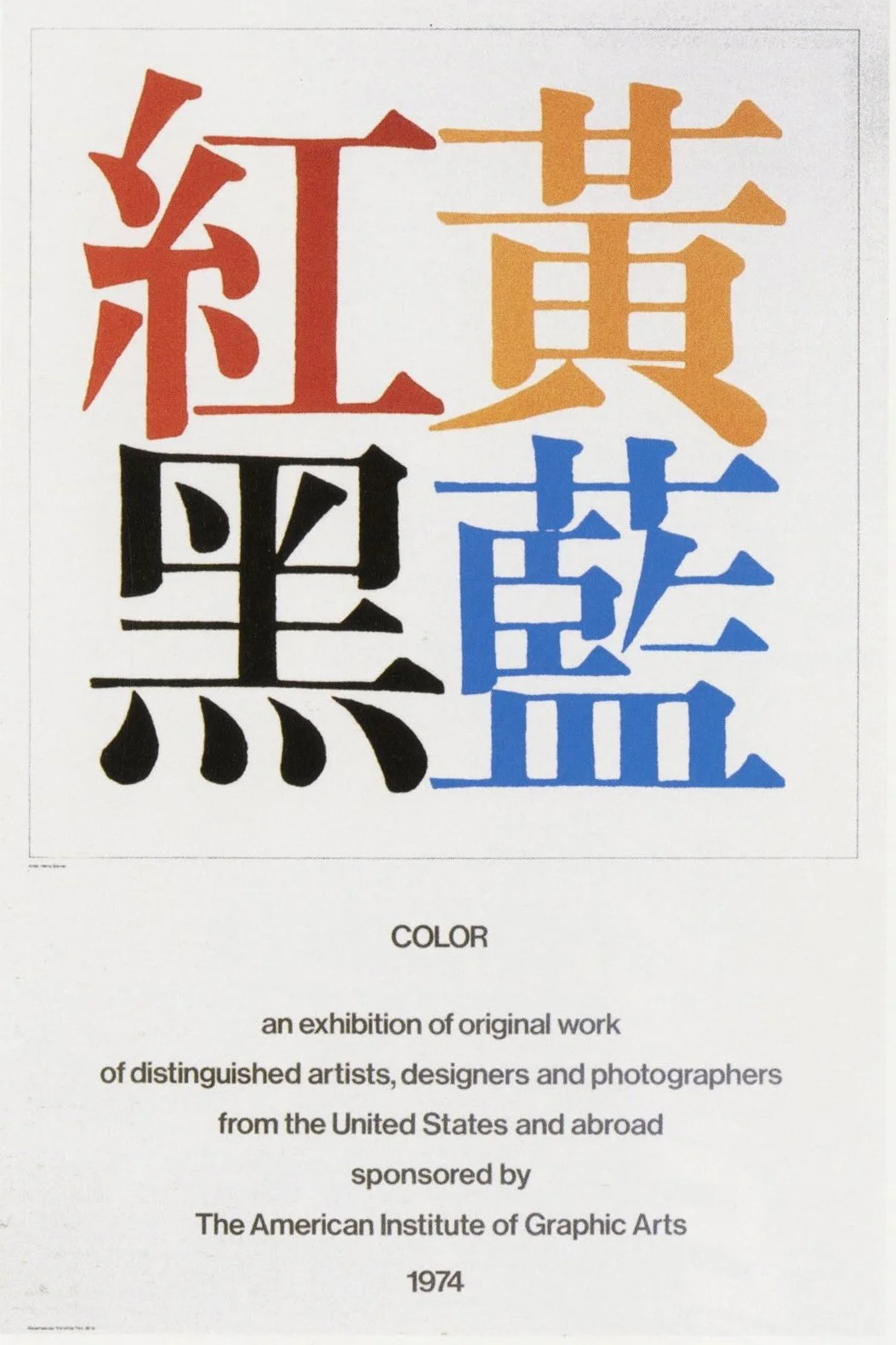
American Institute of Graphic Arts, 1974
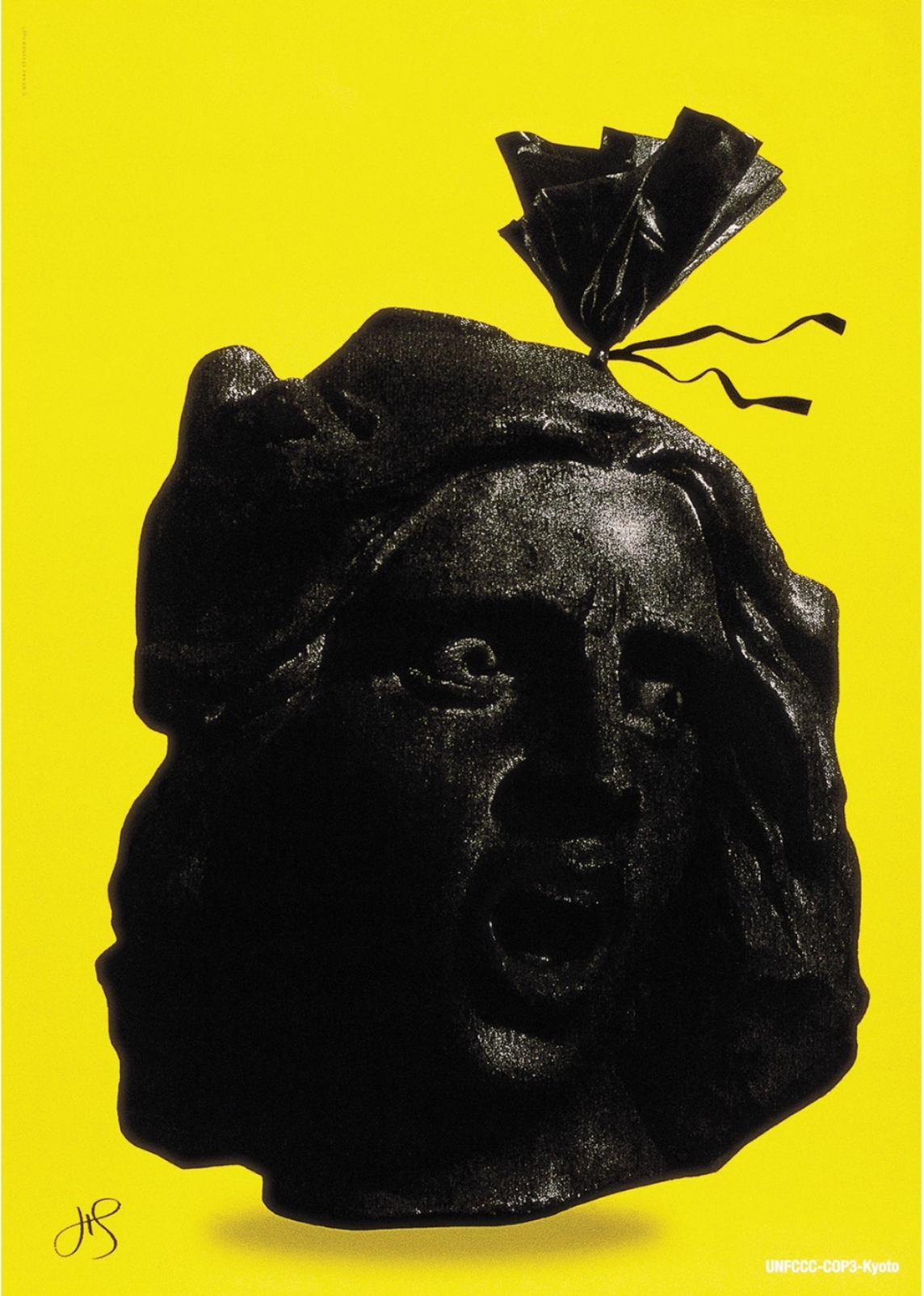
United Nations Framework Convention on Climate Change, Kyoto Protocol, 1997
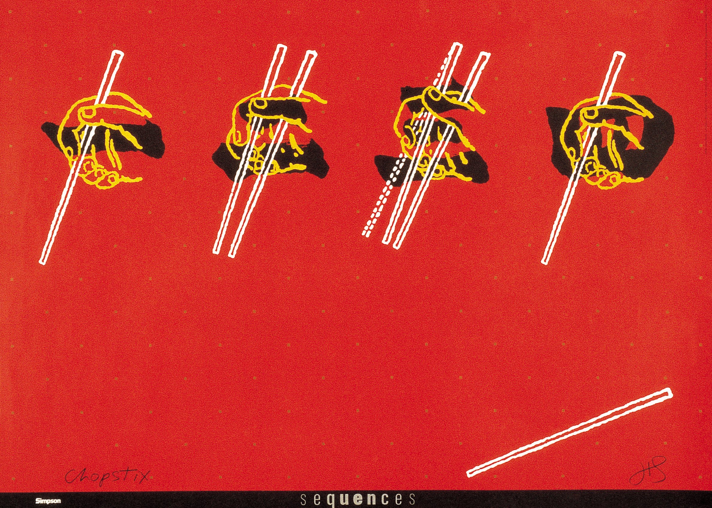
Chopstix, Simpson Paper, 1986

Type, Morisawa, 1991
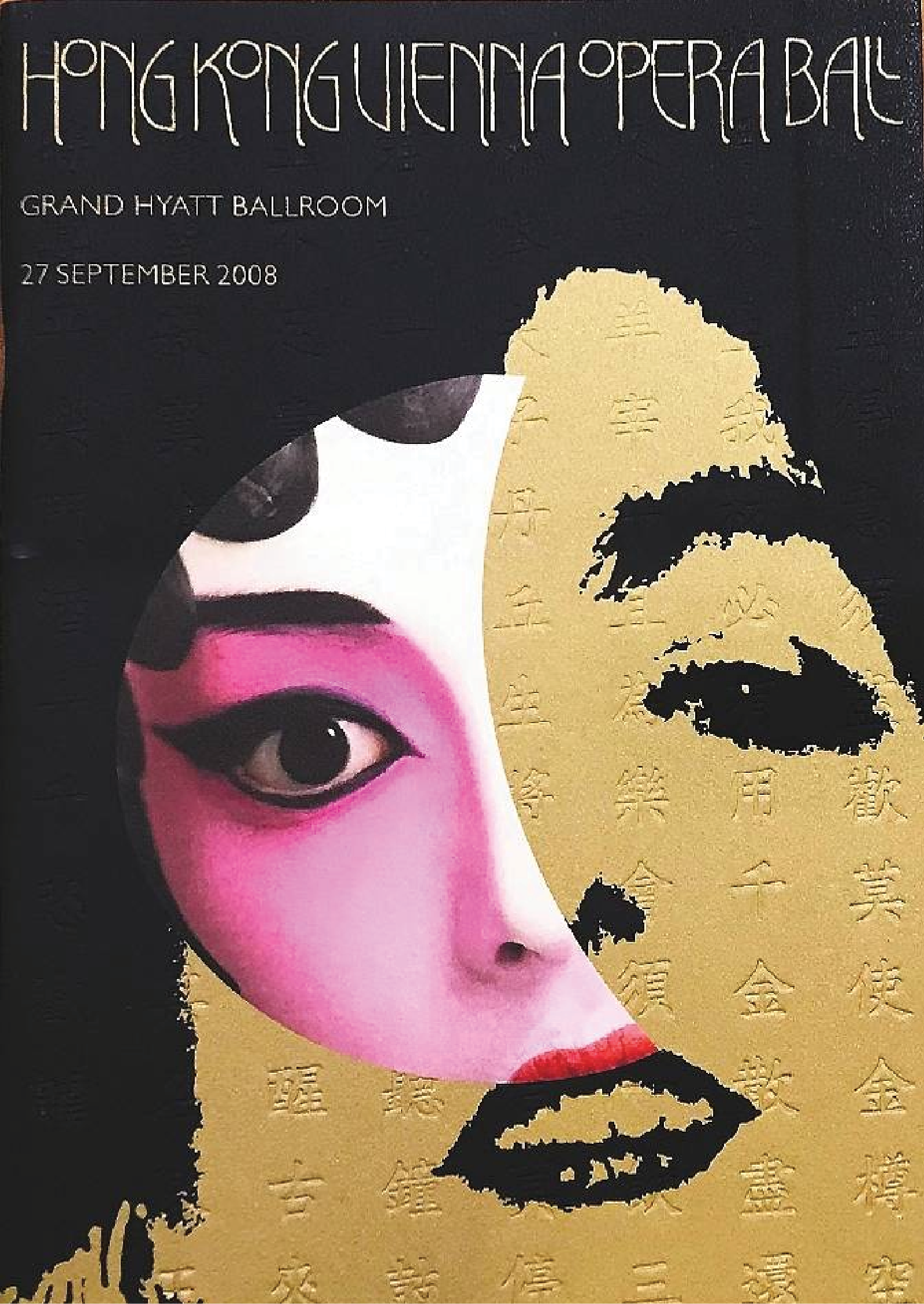
Hong Kong Vienna Opera Ball, 2008
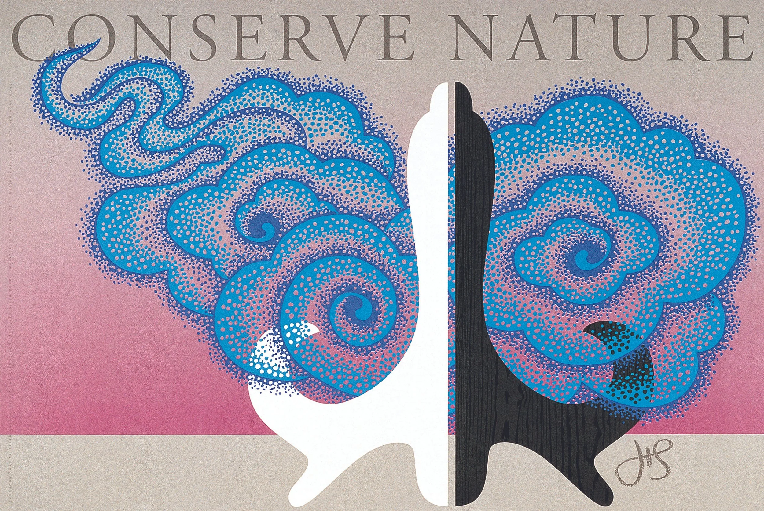
Conserve Nature, 1992
Non Profit Design
Henry has always encouraged designers to take on pro bono work. It is important to give charities the boost in visibility and for designers to expose themselves to different clients.
-
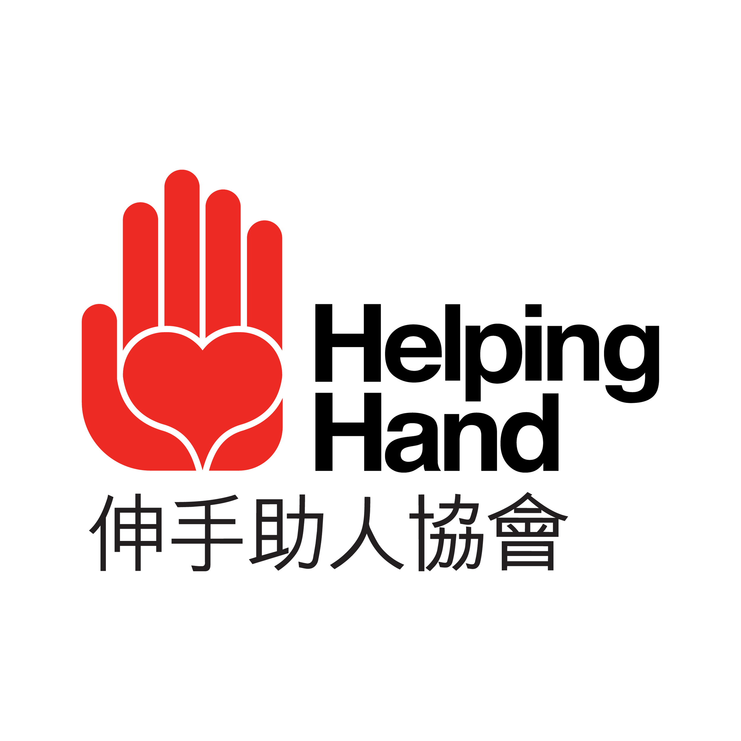
After years of operation, the non-profit that had been doing so much for the community deserved its own logo. The design stems from the name and the charity’s mission of providing assistance to Hong Kong’s senior citizens. An open palm with a heart in its centre — a fine symbol for an organization that gives care. Bilingual to reach its target audience.
-
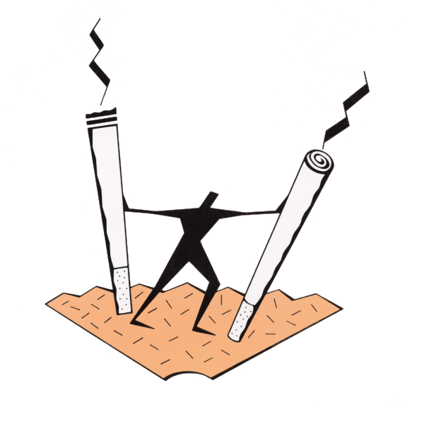
The symbol is focused on reinforcing the individual’s ability to overcome the nicotine habit and be free of addiction. The idea is derived from the biblical story of Samson, with cigarettes replacing the columns. The logo speaks for itself — an expression of health, life, joy. Freedom from addiction.

-
Based on the Girl Scouts’ trefoil shape, incorporating Chinese character “gwong” (光) meaning beacon, in the negative areas. When in color the symbol appears predominantly in magenta — the color of the bauhinia, Hong Kong’s official flower.
-
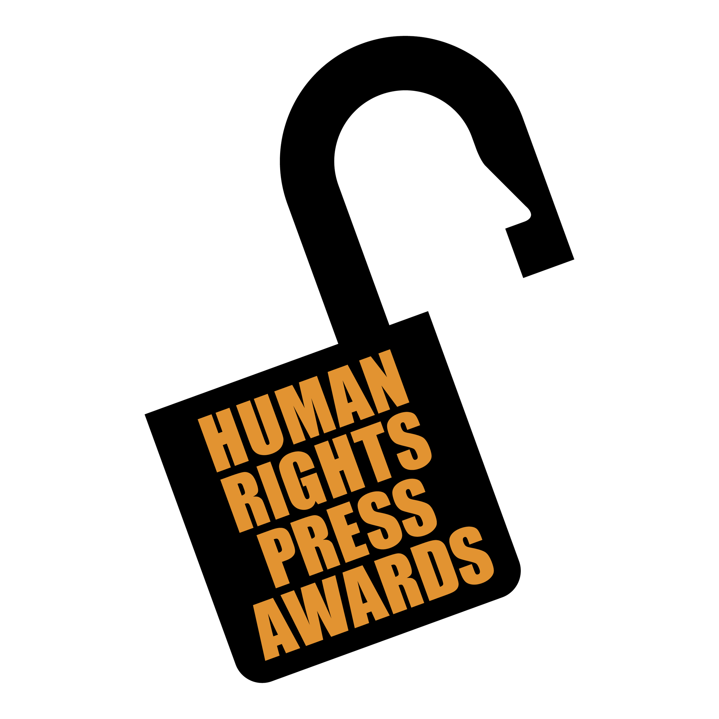
Created for the Human Rights Awards’ 20th anniversary, the award reflects the organisation’s mission to honour journalistic work about jailed dissidents. The curved part of a lock, known as a “shackle”, is an outline of a face – reporters have a “nose” for news.
-
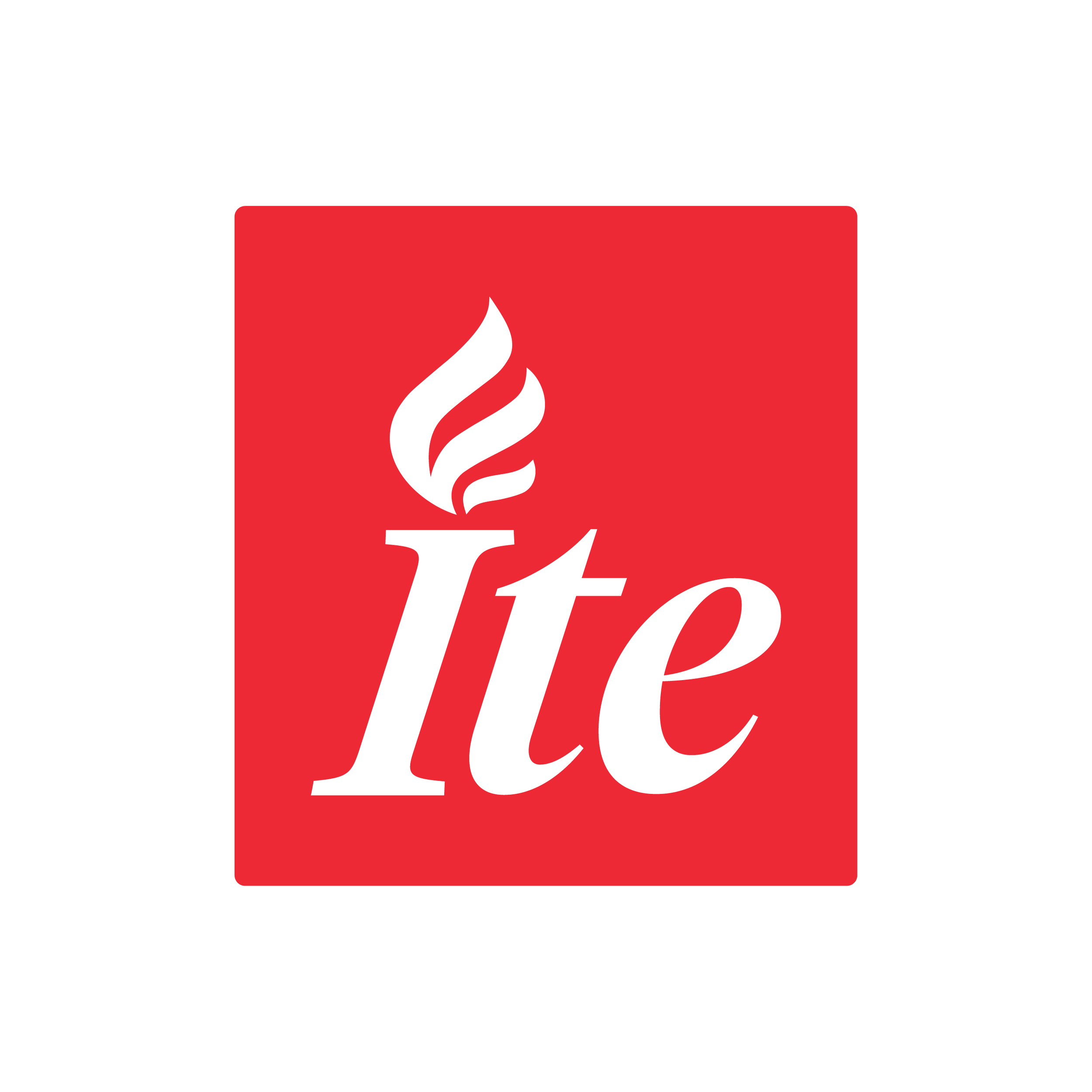
The Lii-Haybyrne Institute for Asian Studies was founded to promote cross-cultural understanding to participating Jesuit high schools through immersive study abroad programmes. The mark highlights the institute’s mission “Ite”, meaning “go” in Latin. The flame evokes St. Ignatius of Loyola’s words “go forth and set the world on fire”. A striking mark, befitting of the institute’s mission.
-
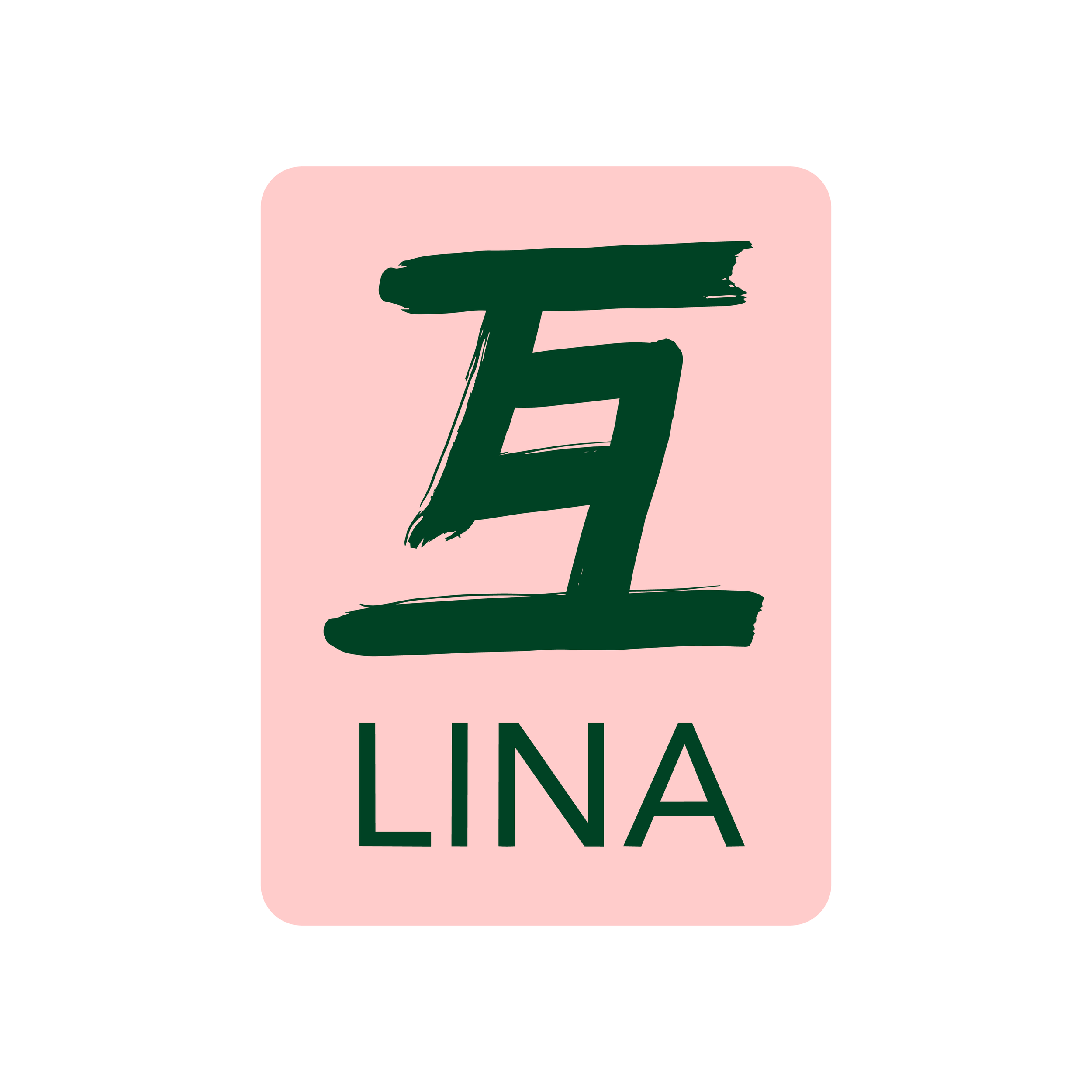
LINA foundation is a Hong Kong-based charitable organisation that promotes music education for people of all ages and abilities. Next to supporting a variety of music activities in Hong Kong it develops and implements its own projects, including concerts, and summer programmes on a non-profit basis.
-
Project Mingde is a social building project to improve rural schooling while engaging civil engineering students, founded by Professor Nicolas S Y Yeung and his late wife Lorene. The mark is built around a unique articulation of the Kai Shu script “Ming” 明 character which stems from HKU’s motto “Mingde Gewu” 明德格物.
-
With over 600 alumni in its Hong Kong chapter, a localized identity seemed fitting. This word mark consists of actual strokes taken from models of classic calligraphy combined with straight lines in Yale blue, projecting a cross-cultural image of unity.
Press
The Untold Story: Duchamp and Steiner’s Creative Encounter
M+ Magazine | 2025
Father of Hong Kong Design Henry Steiner on How His Legacy and That of the City Are Inextricably Linked
Tatler | 2024
石汉瑞个人作品展将在香港举行
V.Feng | 2024
Henry Steiner — the graphic designer behind ‘brand Hong Kong’
Financial Times | 2024
Hong Kong celebrates design guru who left his mark
The Standard | 2024
M+專題展覽「石漢瑞:化圖為語」開幕!解構香港平面設計之父Henry Steiner眼中的香港
Vogue Hong Kong | 2024
Henry Steiner: Branding Hong Kong
M+ Magazine | 2019