

Dairy Farm
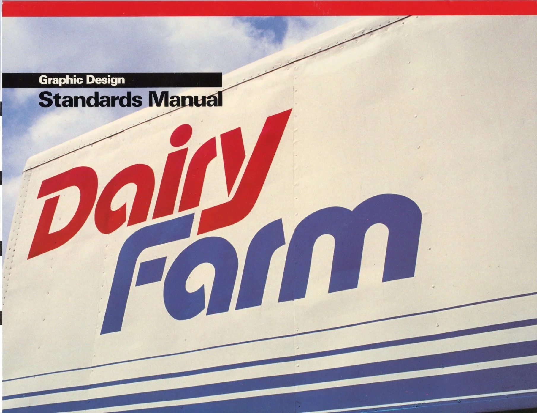
1982 / Dairy Farm
The old Dairy Farm identity was a script wordmark topped with a crown and had been use for a long time. The company wanted to update its logo without appearing to be a completely new company. A more modern wordmark was developed to work in both English and Chinese using specially designed stencil-style lettering. The blue and red colours were retained from the old identity and a decorative “chill band” was incorporated.