

Hong Kong Hilton
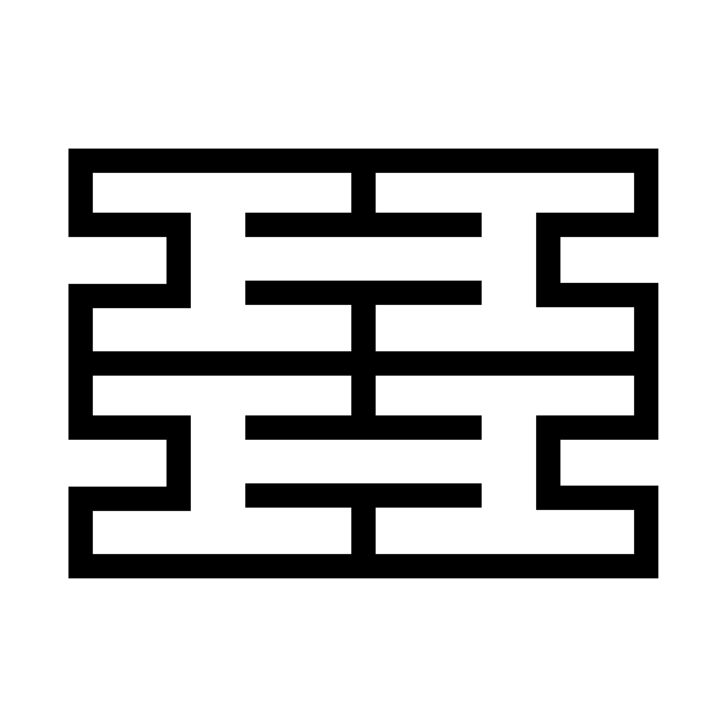
1962 / Hong Kong Hilton
The identity for the American Hotel and stacked A H logo in Egyptian type was loved by the client. It was heavily influenced by Herbert Matter’s railway logo. To meet the task of rebranding Henry cut apart two photostats, outlined the letters, and stuck one H above the other. The resulting mark looked like Chinese latticework and was an instant hit.