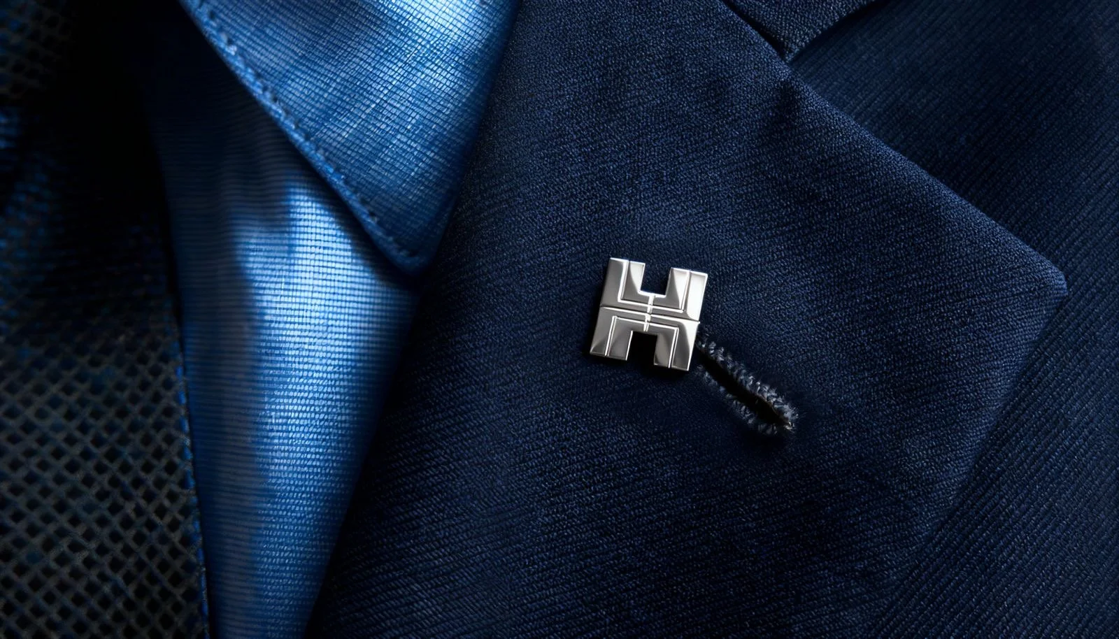
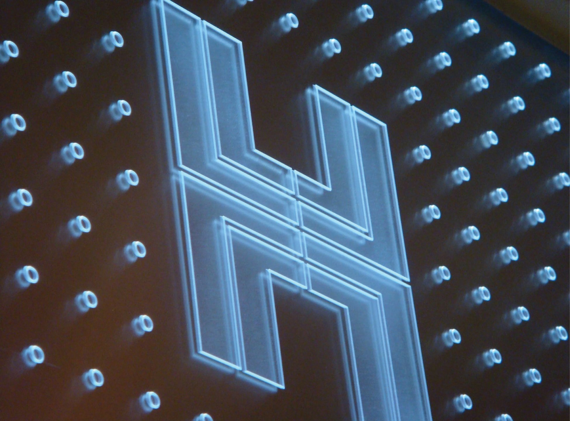
Hongkong Land
As is apparent, the logo it is an “H mark”. The design combines a floor plan with the Chinese character for longevity (壽) and was one of the very first in which Henry demonstrated his signature cross-cultural design style — the conscious incorporation of elements of Chinese vocabulary into his work. It is a testament to the timeless design that speaks to the essence of the client and the environment. Design that endures.