| |
|
 |
|
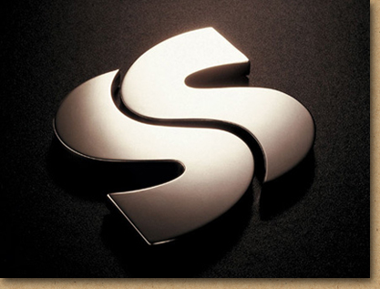
| Mark of the dragon: Ssangyong |
|
|
|
|
| One of South Korea’s
largest chaebols,
Ssangyong was famous at home but needed a
new, less parochial corporate identity to
signify a growing international presence. |
|
| The distinctive double
S spelling of Ssangyong (which means “twin
dragons”) creates an energetic mark
which also alludes to the tai
chi symbol of the Korean flag.
The brand was designed for a vast range of
products and services penetrating increasingly
varied markets. |
|
| The result is an identity
which unifies a diversified group, clarifying
its goals to customers, business partners,
and employees. |
|
|
|
|
|